The Apple iPad 2 Review
by Brian Klug, Anand Lal Shimpi & Vivek Gowri on March 19, 2011 8:01 PM ESTThe UI & Honeycomb Comparison
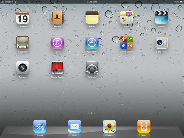
The iOS UI hasn't changed much at all since the iPad launched last year. Apple eventually added folders and multitasking but this is still the same basic iOS we were introduced to with the iPhone 2G. On the plus side it keeps things simple. If you're an iOS user you're likely to feel right at home on an iPad. You can then pick up an iPhone or iPod Touch and get the same experience and even run many if not all of the same apps. Apple has always done a good job of taking care of its users that don't stray from the ecosystem and the iOS universe is no different.
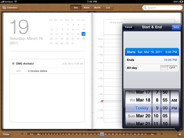
There are still elements of iOS that I believe are unmatched in the industry. Apple does a great job focusing on how something should work and doing its best to implement that. To date I enjoy setting alarms/reminders more on iOS than any other mobile OS I've used.
Unfortunately, the iOS UI remaining relatively constant isn't always good. The multitasking UI is still not what I'd consider ideal. Switching between apps still requires a double tap of the home button, scrolling through a horizontal list of icons and tapping again once you found what you wanted. It's basically a less convenient alt-tab.
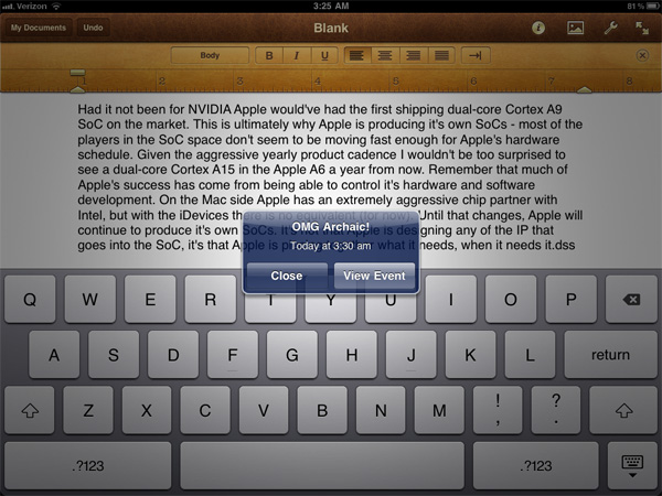
Notifications are also horribly obnoxious. When there was no support for 3rd party notifications in iOS it didn't really matter and the simplicity of the notification system was actually a benefit. However now all apps have the ability to send you notifications and many of them will actually attempt to do so. This results in an experience-breaking barrage of popups front and center on the iPad. While multitasking allows you to switch between an IM app, your email and a web browser, if you're casually talking to someone over IM you'll find yourself interrupted by popups as you try to simultaneously read email or browse the web.
The multitasking and notification limitations in iOS are actually two significant barriers that prevent the tablet experience from actually evolving.
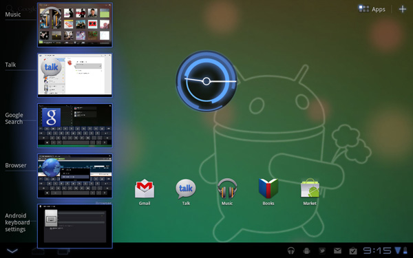
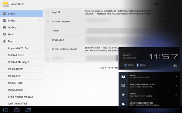
In contrast we have the Motorola Xoom running Honeycomb. You can argue that the Honeycomb UI isn't nearly as smooth or consistent as iOS 4.3, however Google is experimenting with more productivity oriented UIs. Notifications in Honeycomb pop up in the lower right hand corner in a manner similar to what you'd expect from a desktop OS. Multitasking isn't perfect under Honeycomb either but you have an easily accessible list of the five most recently used applications that you can get to via a single tap. Google also took a very desktop-OS-like approach to navigation in Honeycomb - the nav/notification bar at the bottom always occupies screen real estate. It may fade out when you're in certain apps (e.g. watching a movie) but otherwise it's a permanent fixture. While not quite as invasive as the menu bar in OS X or the taskbar in Windows, the Honeycomb nav/notification bar is of the same family.
While Apple has definitely stepped up its ergonomics and performance with the iPad 2, the UI remains dated. I must point out that today, two years after the introduction of webOS, Apple still has yet to offer a multitasking experience that's anywhere close to what Palm did with significantly less resources. I'm not sure if this is a pride thing or a fundamental difference of opinion. If Apple keeps up its release schedule maybe we'll be surprised this summer with iOS 5.




189 Comments
View All Comments
claytontullos - Saturday, March 19, 2011 - link
http://technabob.com/blog/2011/03/18/ipad-2-refrig... kind of fun?vol7ron - Saturday, March 19, 2011 - link
This just goes back to what I've said since the iPad was introduced. It'll be the +1 device that's best for laying around your house. This goes into my review as why it needs to hit the $200-250 price point.Sure it's a nice e-Reader and can entertain with some games and even allow for some production work, but it is still clunky and uncomfortable and to be efficient and productive you need the additional hardware, which are going to bring you in a nice laptop range anyhow.
The 3GS is hitting the $50-100 price point w/ a 2 year contract, which I suggested a year ago. Personally, I still think that should be the price w/o the contract (to be available after-market for gifts/presents), but as long it's available at that point, that's where it needs to be.
I still think the iPad needs to drop to that $200-250 point. It's the coffee table device, which people should consider having 2-3 spread-out in the home [ maybe one in the bathroom ;) ] - if only they could also self-sync wirelessly. I'm not too sure who buys the base model, but the specs alone would keep me from considering it and when you look at the higher spec'd models, it's not as justified when looking at laptops, or other eReaders.
solipsism - Sunday, March 20, 2011 - link
$200 to $250 for a newly released 10” Tablet with an IPS panel? WTF are you smoking? How can you have such an odd mental disconnect between writing that and then writing "The 3GS is hitting the $50-100 price point w/ a 2 year contract”? What part of 2-year contract aren’t you understanding? Do you not realize the carrier is paying Apple more than $200-250 for that 3GS, and you are paying the carrier a lot more than that over 2 years?Pray tell, how would this device be $200-250 when the competition with a 2 decade head start still hasn’t been able to compete on price?
synaesthetic - Sunday, March 20, 2011 - link
I don't get how they sell so many when they're so useless and clunky... and cost so much.Lot of hipsters I guess.
michael2k - Sunday, March 20, 2011 - link
The weight, battery life, and cost (altogether) are unparalleled in the computing world.Smartphones with similar performance characteristics have far smaller screens and lower battery life.
PCs with similar battery life cost far more and weigh far more.
PCs with similar weight (and still double at that) cost far more and have only fraction of the battery life.
PCs with similar cost weigh far more and have drastically lower battery life.
Meaker10 - Sunday, March 20, 2011 - link
A dual core sandy bridge 13" device is going to be far more useful for work and far more powerful.michael2k - Sunday, March 20, 2011 - link
Who said anything about work? For things like reading Anandtech it would be far heavier, bulkier, and with less battery life.bigboxes - Sunday, March 20, 2011 - link
Just admit that it's a toy. The authors laid it out for you on how they prefer to use other devices instead of the iPad. It too bulky for portability and underpowered for any productivity tasks.So, you're telling me (and everyone else here) that you paid $500+ just to surf AnandTech on your couch? Just wondering.
Stas - Monday, March 21, 2011 - link
That's exactly why it cannot cost this much to be a reasonable buy. No, the following purchases are not reasonable: fa- sheep base, soccer moms that buy the latest gadget with most hype for their kids/husbands not even knowing wtf it does, or PR boost in form of including, again, the most hyped device with cars, hotel rooms, air travel, etc (3 categories right there probably account for 90% of all sales). I mean people that understand exactly what the device is, what it's not, and have a clear idea of how they are going to use it. And it doesn't matter how much it costs to make it, how advanced the hardware is, or how "revolutionary" the design is. Given the limited usability of a slim, touchscreen device, I think asking $600+ for one is ballsy.MScrip - Monday, March 21, 2011 - link
-- "Given the limited usability of a slim, touchscreen device, I think asking $600+ for one is ballsy." --That's true about any tablet.
As great as Honeycomb tablets are... they're still not gonna provide a true computing experience.
A $600 laptop will always provide far more functionality than a $600 tablet...
Yet... all these manufacturers are pumping out tablets at an alarming rate.
Apple took the risk and added a new product to their lineup.
If tablets were destined to fail... we wouldn't see Motorola, Samsung and even RIM jumping into the tablet game...