Apple's Redesigned MacBook and MacBook Pro: Thoroughly Reviewed
by Anand Lal Shimpi on October 22, 2008 12:00 AM EST- Posted in
- Mac
Several years ago I was privy to a conversation that didn't make much sense to me. The topic was whether or not PCs could be sold like cars, by model year instead of focusing on specs. The holy grail of PC sales has always been distilling the myriad of system specifications down to a simple, easy to understand number. Intel used to offer its iCOMP rating for microprocessors on PCs sold in stores, benchmarks like 3DMark have attempted to do the same thing as well. It'd be far easier however if consumers simply purchased based on model year; buying a 2008 model year PC would be better and faster than a 2007. The idea obviously didn't go anywhere and it didn't make a whole lot of sense to me given that, unlike cars, computers are generally not as emotional of a purchase.
I think Apple has managed to change that. Nearly every year or so we get a redesigned Mac, iMac or MacBook, and in many cases while they are no faster than their predecessor - they introduce one or two new features or a new design that makes you want them, with all logic cast aside. It's a lot like buying a car.
Apple sells its computers not only based on functionality, but largely based on the form and design. Now all manufacturers do this to an extent, it's just that none of the mainstream PC OEMs do it as much or as well as Apple. Apple's focus on design makes a lot of sense. All PCs can be created equal, these days Apple and Dell use the same components, so the only differences that Apple has to play with are the OS and the design. Thus investing more money into the OS and system design is the right move for a company like Apple.
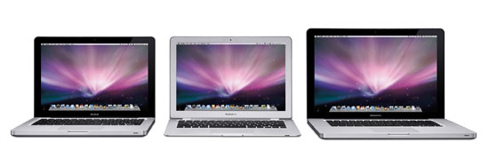
The MacBook, MacBook Air and MacBook Pro
Last week Apple announced its updated MacBook, MacBook Air and MacBook Pro lineup. As expected the changes were largely aesthetic and the new machines look great. But there were also some pretty significant departures under the hood, thus giving me something to do here other than comment on how the curved corners are nice to pet. There are benchmarks to be run, battery life to be tested and something very unexpected to uncover about OS X vs. Vista at the end. I won't dilly dally for too long here, so let's get right to it.
Design Changes/Build Quality
It turns out that all of the extra money Apple is spending on its notebooks goes into materials and build quality. It looks like there are two areas where that money is used: the aluminum chassis and the glass display cover.
The MacBook and MacBook Pro are now made like the MacBook Air: carved out of a single piece of aluminum. That's actually a bit misleading, there are multiple pieces of aluminum that go into the construction of these things, but looking at the keyboard from above you see a single block of aluminum that has been shaped to look like a MacBook.
The PowerBook G4 and the first MacBooks had the keyboard built into a piece of aluminum that sat on top and there was another piece of aluminum that made up the bottom half of the notebook. The two screwed/snapped together and what you had was an aluminum notebook.
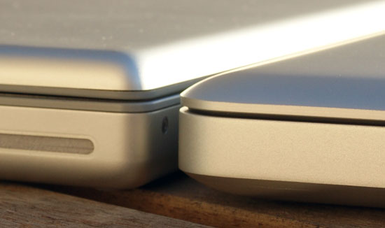
The old MacBook Pro (left) vs. the new MacBook Pro (right), note how the old MBP doesn't fit together nearly as well as the new one
With the new MacBook/MacBook Pro, Apple has effectively flipped its manufacturing process upside down. Instead of having a bottom that curves upwards and is capped off with a keyboard, the new models have a top that curves downwards with two plates that cover the bottom. The distinction is subtle but the difference is noticeable.
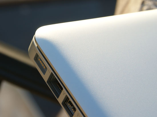
Rounded corners, it's like a big MacBook Air. Cute.
Rigidity is one of the biggest factors in making a notebook feel like it's well built. This is one of the things that IBM got very right with its Thinkpads early on, and something that Apple honestly did an incredible job with on the MacBook Air. The problem with building light notebooks is that the lighter you go, the flimsier the materials and the worse they hold up over time. By making sure the part you come in contact with the most is made out of a single piece of aluminum, Apple helps convey a sturdier built product.
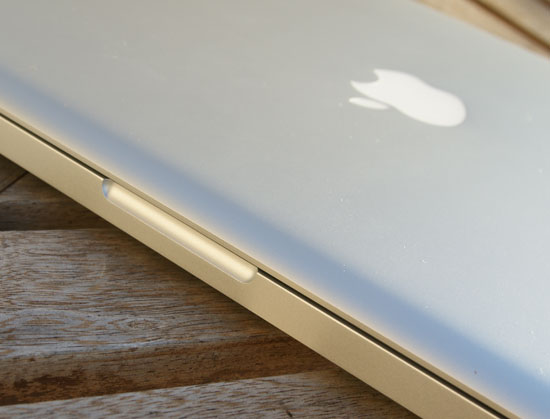
Look ma, no latches!
Also gone is the bothersome latch from the MacBook Pro, the screen magnetically attaches to the keyboard surface when you close it. The latch on the old MBP was the cheapest feeling part of the machine, so I'm glad they fixed it.
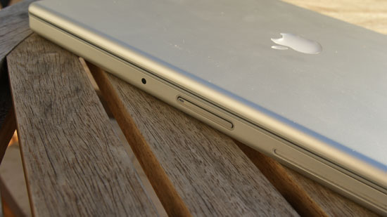
The old latch, ugh.
Apple also made it easier to access the hard drive on these things, there's a nifty removable panel underneath the notebook that unlatches without a single screw. With the cover removed you can replace the battery or, after removing a single screw, remove the hard drive (you'll need to take out four more screws to actually swap out the drive though). This isn't quite as easy as the removable HDD trays you'd find in a Dell, but it does look better.
The design is far from perfect however, the new battery/HDD cover tends to rattle and definitely reduces the solid feeling of the notebook. Thankfully the parts of the notebook you interact with the most feel the most solid, it's just worth pointing out the imperfections.


66 Comments
View All Comments
headbox - Saturday, October 25, 2008 - link
What about XP vs. Vista battery test or... install OSx86 on a few PC laptops :)acfoltzer - Wednesday, October 22, 2008 - link
Hi Anand,I just want to point out that the keyboard on my 2.4GHz MacBook IS backlit. It seems to be a little-documented difference between the 2.0 and 2.4.
Cheers,
Adam
andreschmidt - Wednesday, October 22, 2008 - link
Indeed, that was one of the things I noticed in the article as well. The 2.4Ghz MacBook does have the backlit keyboard.themadmilkman - Wednesday, October 22, 2008 - link
Thank you for the honest assessment about whether to buy or wait. You just kept me from blowing $1300 by upgrading too soon.Ronbo13 - Saturday, October 25, 2008 - link
If you're basing this on the reflectivity of the screens, you need to look at them in person. The pictures are misleading, in that the new MBP is positioned to be reflecting a wall in direct daylight, and the one on the left is reflecting a wall in shadows. The new MBP is a pretty glossy screen. I have one, and I used to have a matte MBP. But the screen is, nevertheless, beautiful. Don't make up your mind until you see it in person.preciousjerry - Monday, March 9, 2020 - link
I needed to switch over to Apple computer, phone, and iPad because of software changes in my business. I was able to purchase a Macbook Air, iPhone 5se, and Ipad Air. These items were either an open box or refurbished with A ratings. Fabulous Prices, all worked and looked new. I am a faithful user of a popular online store that deals in the same items, however, I cannot get these kinds of <a href="https://www.makeoverarena.com/sabwap-movies-games-... especially at this condition and prices.